UI / UX Design
Torus Biomedical Solutions
Tools Used
01
Overview
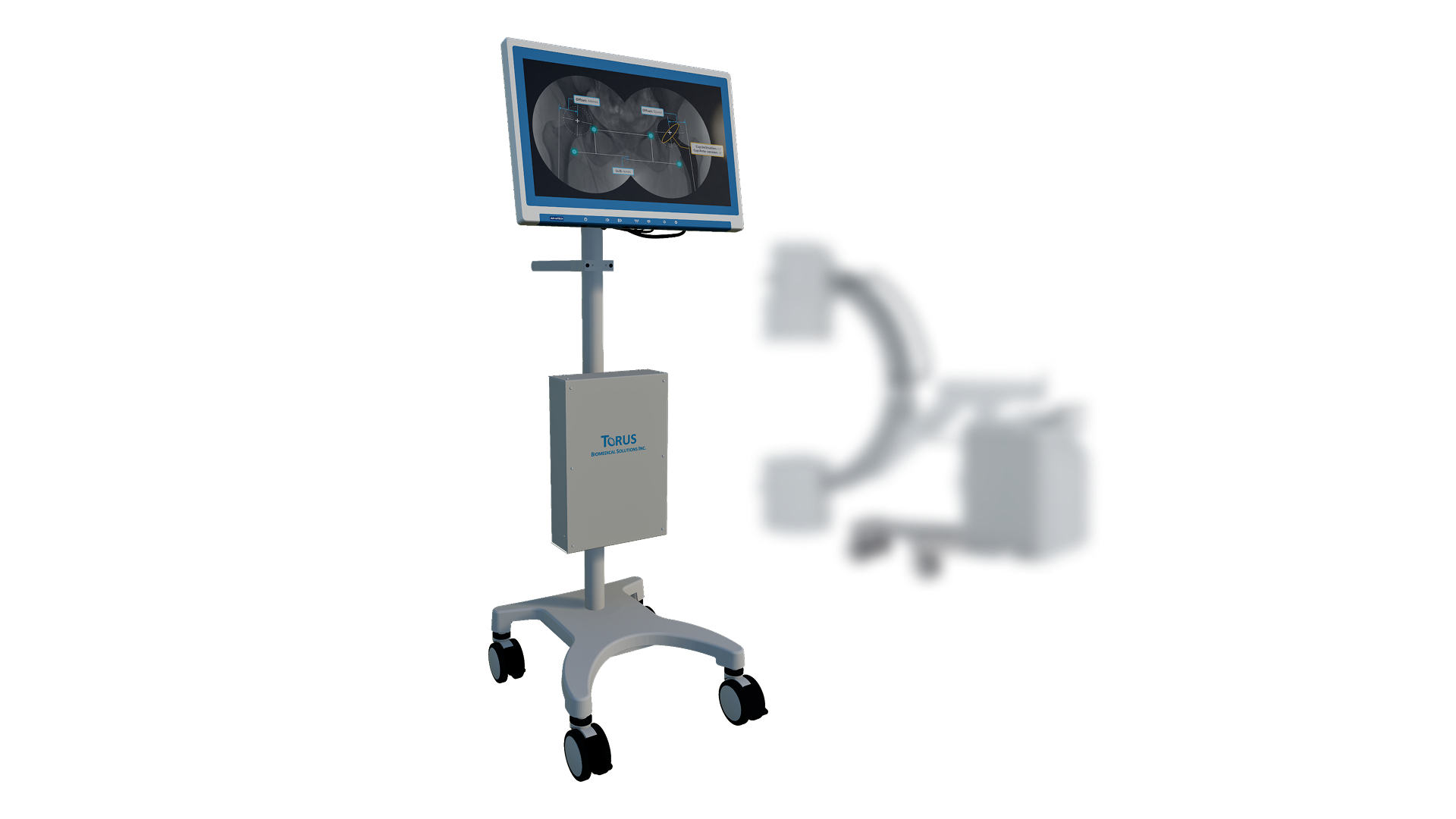
Torus is a C-arm imaging application that helps surgeons capture the right femur-trauma X-ray with fewer test shots. I joined as a UX/UI contributor on the imaging team.
My focus was the guidance interface: the reference versus corrected image comparison, the real-time sensor feedback, and the interactive prototypes surgeons reviewed. The aim was less radiation and shorter procedures.
02
Understanding the Surgical Workflow
I started by watching the surgical team run a femur-trauma case to learn the existing C-arm routine. The key insight: surgeons took several test shots to find the right angle, and every shot added radiation.
I mapped the loop of position, shoot, check, adjust, repeat, and flagged the positioning guide as the highest-leverage thing to fix. That reference image shaped the comparison layout.
03
Structuring the Guided Flow
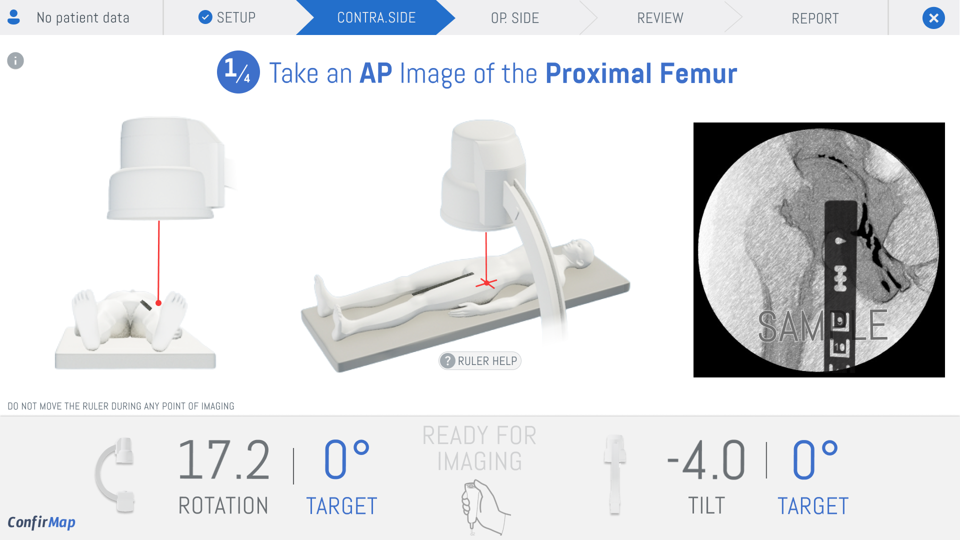
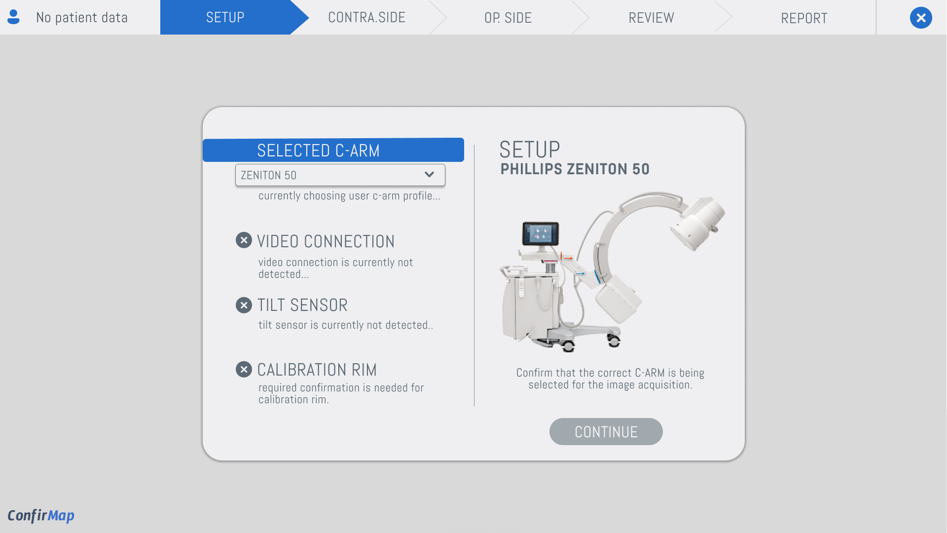
The workflow had to be linear and unambiguous. I broke the ConfirMap process into five clear steps, Setup, Contra.Side, Op. Side, Review, Report, with a visible progress bar so the surgeon always knows where they are.
The setup screen surfaces only what matters: three hardware checks that gate the workflow. I intentionally hid the dozens of other diagnostics the hardware team could show, because more information would only slow the surgeon down.
04
Real-Time Alignment Feedback
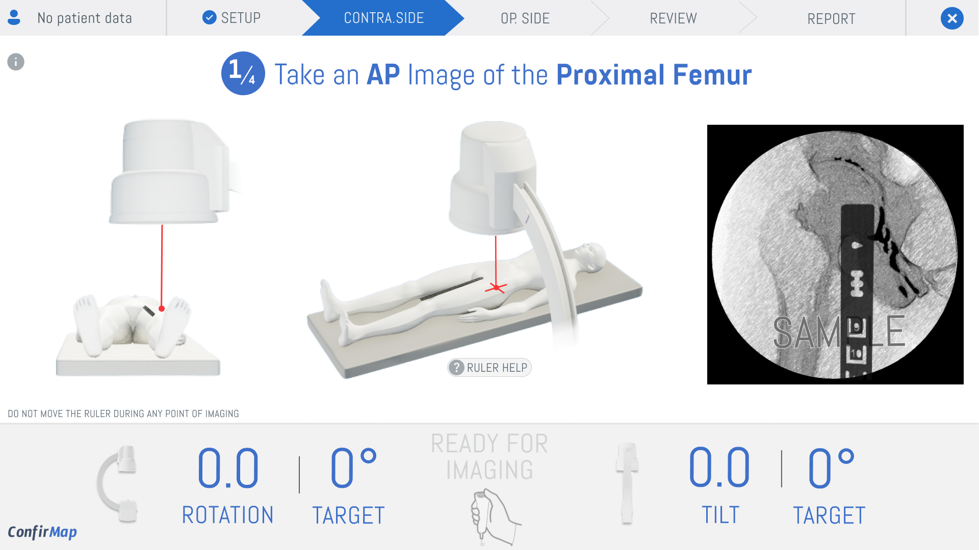
The core interaction is live alignment feedback. I designed the rotation and tilt indicators to shift red to yellow to green as the C-arm nears the target angle, giving a clear stop signal instead of a vague 'get it straight.'
I prototyped the micro-interactions in Figma with animated state changes and checked the timing against real C-arm sensor data, so the visual feedback matched how the hardware actually behaves.
05
Prototyping with the Clinical Team
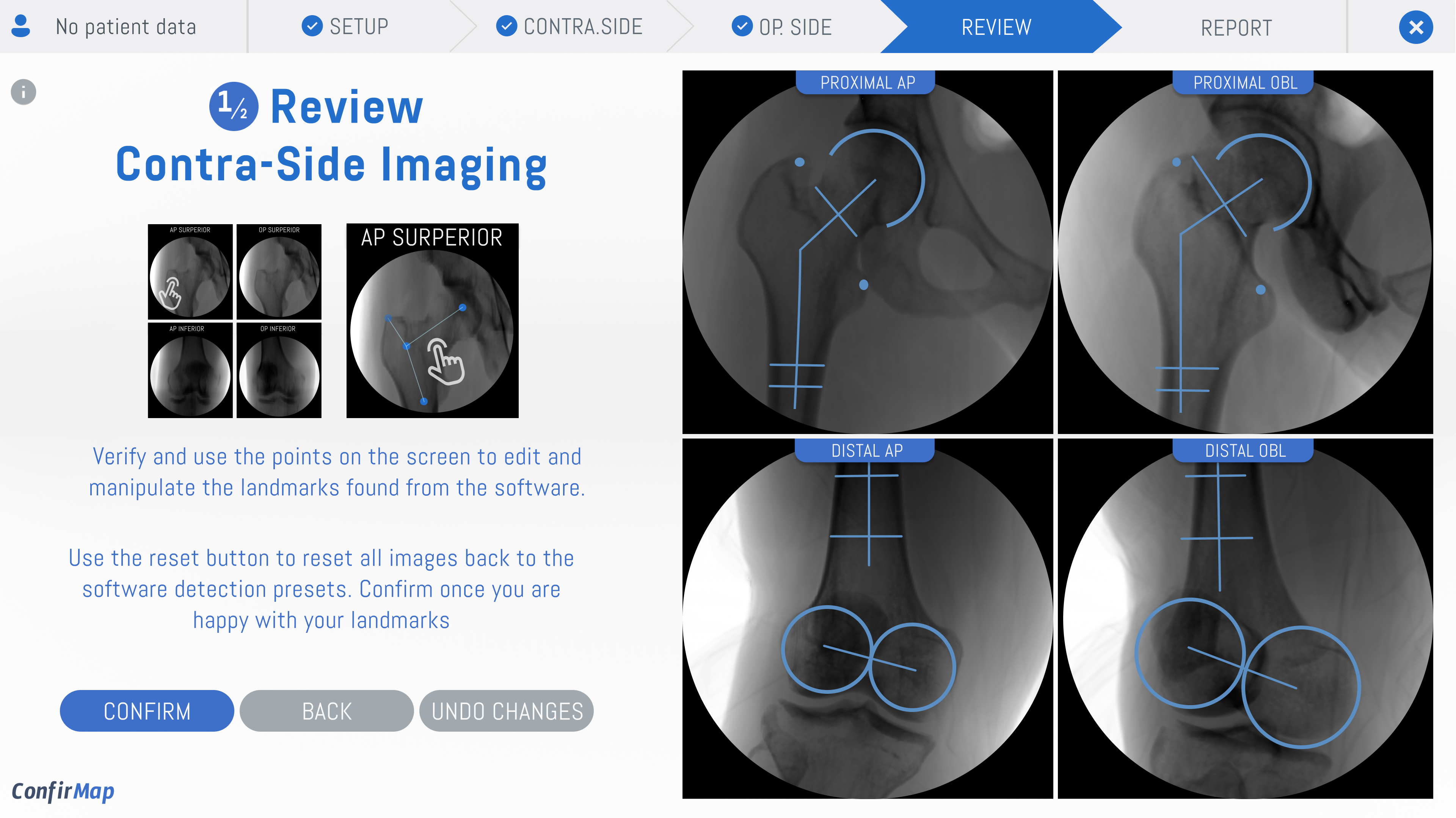
I built interactive prototypes for each workflow step and ran feedback rounds with the clinical team. The review screen went through three iterations: the first showed one X-ray view at a time, but surgeons needed all four angles at once.
I revised to a four-panel layout where each view zooms on tap. The team confirmed the landmark auto-detect plus manual correction flow matched how they think: check, then adjust.
06
What I Learned
The biggest lesson was designing for split-second decisions. In a consumer app, ambiguity causes a mis-tap. In surgery, it causes a retake and more radiation. Every label and color had to read at a glance under OR conditions.
If I rebuilt it, I would dry-run the prototype with a surgeon on a training phantom before development, so the flow is validated against real practice, not just the mock reviews.
Impact
Designed a C-arm guidance interface aimed at reducing radiation exposure and surgical time during femur trauma procedures.
Delivered a 6-step process flow (sketch, wireframe, assets, mockup, prototype, feedback) for surgeon review.